User Guide#
Note: This guide is fixture-backed and written against the current MVP dashboard behavior. The screenshots are generated from the frontend fixtures rather than a live graph server, so the exact names and values may differ from your running system while the UI behavior should remain representative.
ezmsg-dashboard is a live operations view for an ezmsg graph. It gives you three main workflows:
understand structure in the topology view
inspect and patch settings
inspect publisher/subscriber health and timing traces
watch the data a publisher is actually sending
Main Layout#
The dashboard has three major areas:
Topology: the large graph view
Publishers: profiling and subscriber health
Settings: component settings and patch controls
Topology#
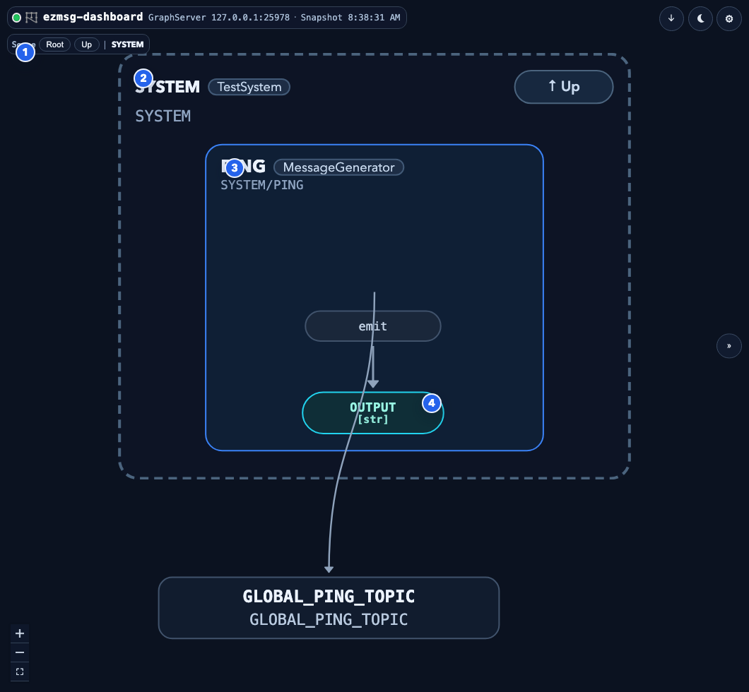
Scope controls:
Root, breadcrumb chips, and scope context let you move between collection levels.Active collection frame: the dashed scope card shows the currently opened collection.
Unit card: each unit shows its name, type, address, tasks, and streams.
Stream/topic node: stream endpoints, topics, and relays are rendered as pills connected by edges.
What To Do Here#
Click a unit to focus it in Settings, and to expand the topics it publishes in Publishers.
Click a publisher or subscriber stream to focus it in Publishers and fit the topology view.
Use the floating viewport shortcuts to toggle layout direction, theme, or open global settings.
Drag the divider between the topology and the inspector to change how much width each gets. Double-click it to return to the default, or focus it and use the arrow keys (
Home/Endjump to the widest/narrowest inspector). The width is remembered, and also appears asInspector Widthin global settings.Use
Openon a collection to descend into that scope.Use
Upor breadcrumbs to move back out.
Reading The Graph#
Collections are dashed frames.
Units are solid cards.
Inputs and outputs are color-coded pill nodes inside units.
Topics and relays appear as standalone pill nodes when they are collection-owned or orphaned.
The legend in the lower-left of the topology can be toggled on if needed.
Settings#
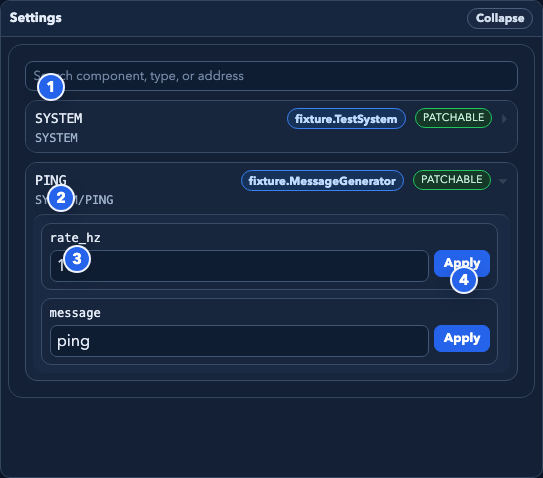
Search: filter components by address, name, or type.
Component row: select the component you want to inspect or edit.
Field editor: settings fields are rendered with a widget appropriate for their type when possible.
Apply button: submits a patch for that field only.
Settings Behavior#
Only components with patchable settings can be edited.
Patchable components are marked
PATCHABLE.Read-only components are marked
READ ONLY.The dashboard patches one field at a time.
Successful patches show a short applied status inline.
Failed patches show an inline error.
Supported Field Styles#
Boolean: checkbox
Number: numeric input with bounds when available
Choice: select menu
Text: single-line text input
JSON / structured fallback: text area or serialized value editor
Float fields may hold values JSON cannot represent. These are displayed as
Infinity, -Infinity, and NaN, and a float field accepts any of those
spellings (inf, -inf, nan work too). Integer fields require a finite
value.
Publishers#
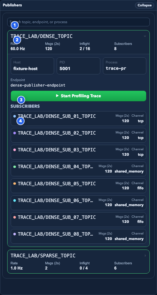
The Publishers pane currently centers on four things:
Search: filter publisher rows by topic, endpoint, or process id.
Publisher row: surfaces always-on snapshot metrics for a publisher topic.
Trace control: starts or stops profiling trace capture for the selected publisher endpoint.
Subscriber row: shows the subscriber topic, channel kind, and snapshot message count. Expanding one shows host, pid, process id, and endpoint id.
What Is Listed Here#
Only data publishers. A unit that exposes dynamic settings also gets a
control-plane publisher on <unit>/INPUT_SETTINGS, created the first time one
of its settings is patched. It publishes only when a setting changes, so it sits
at 0.0 Hz and a profiling trace on it can never produce a sample. These are
hidden by default; enable Show settings channels in Publishers (debug) in
global settings to see them.
Typical Workflow#
Search for a topic or endpoint.
Expand a publisher row.
Inspect its rate, message count, inflight state, and host.
Review the subscriber list.
Start a profiling trace if the publisher needs timing-oriented investigation.
Trace Dock#
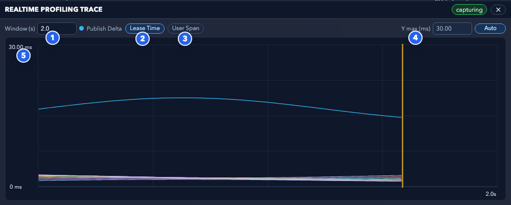
The trace dock exposes five main controls and readouts:
Window: controls how many seconds of trace history are visible.
Lease Time toggle: shows per-subscriber lease timing traces.
User Span toggle: shows per-subscriber user-code span traces.
Y max / Auto-Fixed: sets a manual ceiling or lets the trace dock auto-scale the vertical axis.
Trace canvas: plots publish delta, lease time, and user span series over time.
Trace Workflow#
Start profiling trace from a publisher row.
Wait for the trace dock to populate.
Adjust the time window if the graph is too sparse or too dense.
Switch between
Lease TimeandUser Spanas needed.Switch
Y maxfromAutotoFixedif the auto scale is making comparisons hard.
Data Viewer#
View Data on an expanded publisher row opens a live view of what that
publisher is sending, in a dock below the topology. It needs the viz extra
(pip install ezmsg-dashboard[viz]); without it the button is disabled and
says why.
The view opens on whatever the data suggests, and a View dropdown appears
when a stream supports more than one. A (time, ch) stream whose ch axis
carries real x/y positions opens as a sweep — time is what it is about — and can
also be drawn as a channel map; a map stream can equally be drawn as a sweep, to
watch one electrode’s value move. Switching is instant and does not re-subscribe:
every view is a different reading of the same frames.
The views:
Sweep for anything with a
timeaxis. Traces are stacked one per channel, oldest to the right of the cursor, with a blank gap marking where “now” is.Spectrum for anything with a
freqaxis.Channel map for a
chaxis carrying non-zerox/ypositions, drawn as a diverging colour map at each electrode’s real position.Inspector for everything else, including messages no plot can draw.
The map is offered only when there is one position per drawn channel. A stream
that folds (ch, feat) into channels has twice as many traces as electrodes, so
pin the feature first and the map becomes available for that selection.
Controls#
Mode:
Plot, orInspect onlyto stop streaming samples and just watch the message description.View: which of the stream’s supported views to draw, when there is more than one.
Window: how many seconds of signal the plot shows. This is the most important control on a fast stream — it sets how many samples each column summarises, and therefore both what you see and how much data crosses the wire. A 30 kHz stream at a 2 s window puts about 80 samples in every column.
A slow stream gets fewer, wider columns instead: 2 s of a 100 Hz signal is 200 samples, so the plot draws 200 columns rather than stretching them across the full width. The caption under the plot always reports what is actually drawn — the span, the column count, and the samples each column stands for — which will differ from what you asked for if the stream is too slow to fill the request.
Channels: how many channels to show, and which. Streams with more channels than fit are opened on the first 32; drag the slider to move through the rest. Each channel keeps its colour as you scroll.
Folded dimensions: some streams fold more than one dimension into channels — 256 electrodes × 2 features is 512 traces. Those get composite names (
E012/rate, orrate/E012depending on which way the stream folds them), and a dropdown per small folded axis lets you pin it, so you can look at one feature across every channel. The dropdown is offered only when the pin selects a set the plot can draw; the composite names are always there.Autoscale: scales to the traces currently on screen, over the whole window. Narrowing the channels — scrolling, or pinning a folded axis — rescales immediately, which is what makes a stream mixing units readable: a spike-rate feature beside a band-power one is otherwise flattened against the rail by the louder of the two. Turn it off to hold the scale still while comparing.
Gain: multiplies the amplitude of every channel.
Inspect: shows the message’s dims, axes, and attrs alongside the plot.
Drag the dock’s top edge to make it taller — worth doing before opening a stream with many channels, since legibility is set by how many pixels each channel gets.
The readout under the plot gives the window, the column count, the samples each column stands for, and the amplitude the traces are drawn against; the header gives the mode, channel count, sample rate, and how fast messages are arriving.
What The Badges Mean#
live / waiting / error: whether the tap is receiving anything.
dropped: the viewer fell behind the publisher and samples were lost, so there is a real gap in the trace. Brief and occasional is normal on a very fast stream; constant means the plot is not keeping up.
Cost To The Graph#
Watching a publisher does not slow it down. The dashboard subscribes as a leaky subscriber, which drops messages rather than applying backpressure, so a stalled browser cannot stall the pipeline it is watching. The tap adds no edge to the topology and does not appear in the Publishers pane. Several browsers watching one topic share a single subscription.
Sample data is reduced before it is sent — to the width of your plot and the window you asked for — so bandwidth follows the size of the plot rather than the publisher’s sample rate. A 256-channel 30 kHz stream on a 2 s window costs roughly 700 KB/s; the same stream sent raw would be 60 MB/s.
Theme And Layout Controls#
The top-right dock in the topology viewport contains:
Layout toggle: left-to-right vs top-to-bottom
Theme toggle: light vs dark
Global settings: snapshot poll frequency, theme, default layout, edge connector type, default trace metrics, inspector width, legend/minimap visibility, auto-fit/auto-focus behaviors, and whether the Publishers pane shows settings channels
Good Troubleshooting Patterns#
If the graph is visually dense, switch layout direction.
If the inspector feels cramped, increase inspector width in global settings.
If the publisher list is noisy, use the publisher search box to narrow by topic, endpoint, or process.
If a trace looks flat or over-compressed, adjust
Window (s)or switchY maxfromAutotoFixed.If a component is not editable, check whether it is marked
PATCHABLEin Settings.
Current Limits#
Screenshot examples in this guide come from deterministic fixtures, not a live graph.
The Publishers pane depends on profiling snapshot data. A stream can exist in topology while Publishers remains empty if profiling data is not available for it.
The dashboard emphasizes readability and navigation over exhaustive raw protocol inspection.
Message payloads do not have to be numpy arrays. MLX, torch and jax arrays are read as numpy views without copying.
bfloat16is widened by reinterpreting its bits rather than by asking the producing framework to cast, because a cast on an array that arrived over ezmsg’s transport runs on a device that cannot address the buffer and returns garbage instead of failing.The data viewer can only read topics whose message class the dashboard’s own Python environment can import.
ezmsgunpickles messages in the subscribing process, so a message type defined in a script’s__main__, or one from a package the dashboard does not have installed, never reaches the viewer. The panel detects this — an active publisher with no messages arriving — and says so rather than looking idle.The viewer draws at most 512 channels at once. That is a limit on the view, not on the stream: a wider one is plotted a window at a time and scrolled. The wire cost follows columns per second rather than channel count, so a 2048 channel stream on a 2 s window costs about 6 MB/s.
A stream wider than the browser’s WebGL texture limit — 8192 channels on current hardware, 2048 at the spec minimum — cannot be held in a plot buffer. The panel says so and falls back to the message inspector rather than drawing a subset under the whole stream’s labels.
Channel windowing happens in the browser: the wire still carries every channel even when only some are on screen. That keeps scrolling instant, and is worth revisiting if channel counts grow much beyond a few hundred.
Legibility, not the renderer, is the practical ceiling on channel count. A few hundred traces in a few hundred pixels is a solid block whatever draws it; use the channel window, and a taller dock.
Sweep plots need WebGL2. Where it is unavailable the panel falls back to the message inspector and reports the reason.